Bite Balance - Calorie tracking app
A calorie-tracking app designed around behavioral psychology not willpower. Built on Nir Eyal's Hooked model to form lasting habits through camera logging, smart nudges, and a reward system that actually keeps students coming back.

OVERVIEW
Eating well is hard enough.
Tracking it shouldn't be.
Task success rate across 5 tasks
Ease of use rating (avg)
User confidence score
Delighters identified
Key Challenges
DESIGN PHILOSOPHY
Not built on willpower.
Built on behavioral psychology.
Most calorie trackers ask users to be disciplined. Bite Balance was designed differently around Nir Eyal's Hooked Model, a four-phase framework for building products that form genuine habits. Every feature maps to one of four psychological levers.
01 — TRIGGER
Timed push notifications (set by the user) create the habit window. Over time, internal cues guilt, hunger, a goal take over.
DESIGNED INTO
Push notification onboarding (user-set times)
Meal reminder system
Daily goal visible on home screen
02 — ACTION
Point, snap, done. Camera logging removes the friction that kills most tracking habits by week two.
DESIGNED INTO
Camera scan adjacent to search bar.
One-tap food entry from scan result
Servings + toppings for complex meals
03 — REWARD
Variable rewards unpredictable enough to create anticipation, meaningful enough to feel earned discounts.
DESIGNED INTO
Daily streak rewards visible on home screen
Variable discount unlocks (10%, 15%, 25%)
Milestone-based offers.
04 — INVESTMENT
Every meal logged makes the app more goal adaptive.Your history becomes the reason you stay.
DESIGNED INTO
Calorie goal adapts to logged history
Weekly & monthly progress analytics
Unlockable AI meal preps over time
RESEARCH & DISCOVERY
5 participants.
5 tasks. Real insight.
I conducted 5 moderated usability testing sessions (30 minutes each) with participants who either use or are interested in calorie tracking apps ranging from first-timers to daily users. Each session covered 5 core tasks covering the full app journey.
STEP 01
Key Challenges
Screened for users with varying experience from first-time trackers to daily app users.
STEP 02
Moderated Sessions
30-minute sessions covering onboarding, logging meals, checking rewards, and progress.
STEP 03
Frequency Matrix
Mapped issues by frequency and severity Low, Medium, Serious, Critical.
STEP 04
Insights → Hypotheses
Each insight became a testable hypothesis and a design change to validate.
Alerts are a delight
I have many tasks to complete in a day. These alerts will really help me log my food." The push notification feature was consistently praised users found it motivating without being intrusive.
Scan feature invisible to 4/5 users
Every user wanted to use the in-app food scanner but 4 out of 5 couldn't find it. The button was buried at the bottom of the screen, far from where users searched.
Multi-ingredient logging breaks down
When users tried to log meals with multiple ingredients, the flow broke. No "servings" or "toppings" fields meant meals couldn't be accurately captured.
Rewards system motivates return
Task Completion Analysis
Across 5 tasks with 5 participants, the overall success rate was 92% — with no fully failed tasks.
DEFINE
Mapping the happy path.
Before wireframing any screen, I mapped the complete user journey from internal and external triggers (guilt, health goals, push notifications) through onboarding, food logging, and reward collection. This gave me a clear picture of where friction points could develop and which flows needed the most design attention.
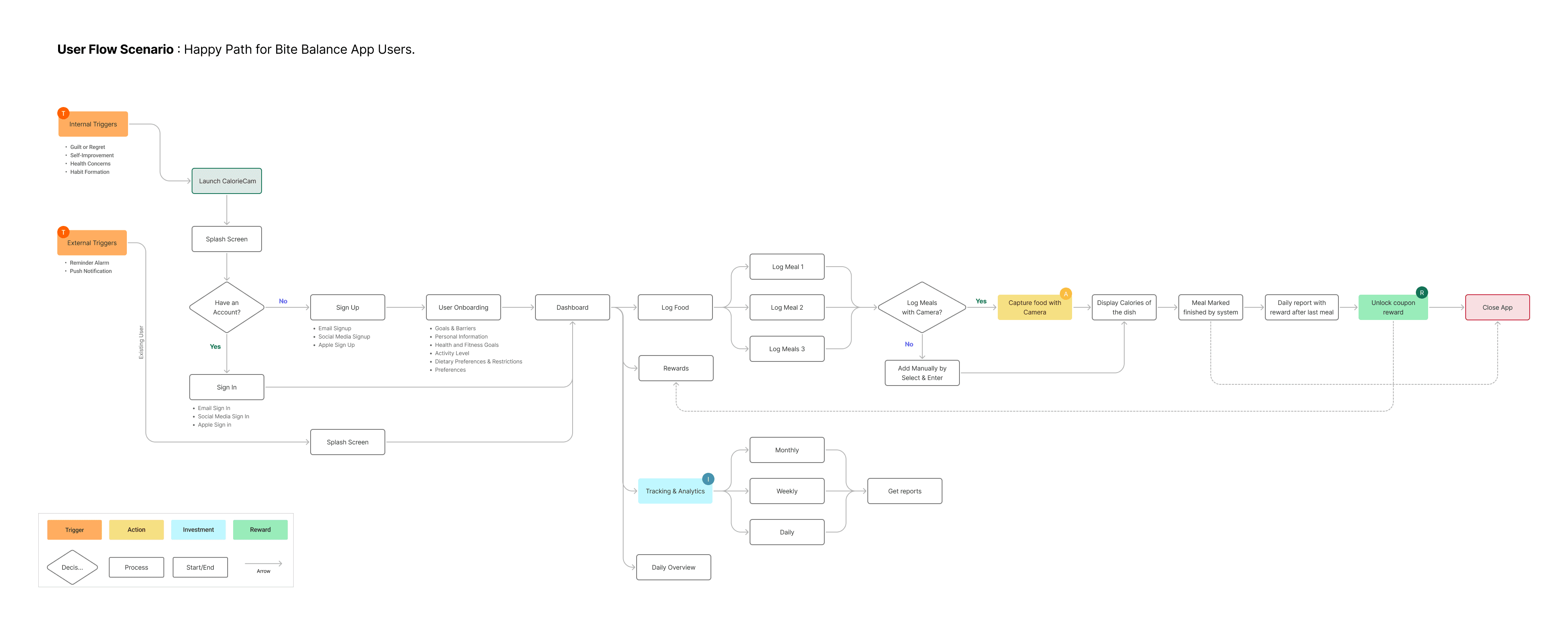
Internal Triggers → Sign Up → Dashboard → Log Food → Rewards
Feature Prioritization - MoSCoW
I used MoSCoW to establish clear feature priorities making sure the must-have flows were rock-solid before investing time in enhancement features.
WIREFRAMES
Lo-fi first.
Questions before pixels.
Wireframes let me test layout assumptions before committing to visual design. I worked through four core flows, Login, Onboarding, Navigation, and Food Logging. Sketching each screen at low fidelity to validate structure, information hierarchy, and interaction logic before touching color or tyPE.

Lo-fi Wireframes · Login · Onboarding · Navigation Screens · Food Logging
VISUAL DESIGN SYSTEM
Colors and type that work as
hard as the product.
The visual identity for Bite Balance centers on a natural, energetic palette, lime green as the primary brand color communicates freshness and health without clinical sterility. The Outfit typeface brings warmth and readability to a data-heavy interface.
Typography - Outfit
One typeface, used consistently across all weights. Outfit's geometric construction brings a clean, modern quality that feels appropriate for health-tech without being cold.
H1 · 32px · Weight 700
H2 · 24px · Weight 600
Body · 18px · Weight 400
Small · 12px · Weight 400
HI - FI SCREENS
From wireframes to
83 screens.
The full Bite Balance hi-fi prototype spans 83 screens across onboarding, food logging, progress tracking, and rewards fully interactive in Figma. Every design decision traces back to a user research finding or a validated hypothesis.
The Hooked Model explains why some products become habits and others get deleted after a week. It's not about features — it's about engineering the right sequence: an external trigger pulls users in, a frictionless action keeps them there, a variable reward keeps them curious, and an investment makes them feel ownership. Bite Balance was designed to run this loop daily.
TRIGGER
The nudge that starts the loop
External triggers (smart meal-time notifications) and internal triggers (the feeling of not knowing what you ate) prompt users to open the app. Notifications are timed to meal patterns not clock time.
View Prototype
Alerting the users

ACTION
The simplest possible log
The core action — logging food — had to be as close to zero effort as possible. Camera-based logging with instant AI recognition removes the barrier of searching and manually entering every item.
View Prototype


VARIABLE REWARD
Unpredictable enough to keep coming back
Fixed rewards stop working. Variable rewards — sometimes you get a streak bonus, sometimes a new badge, sometimes a weekly insight — create the same curiosity loop that makes social media sticky, applied to health goals.
View Prototype

INVESTMENT
Data that belongs to the user
The more users log, the more accurate their personal calorie baselines become. Their history, their trends, their streaks — all of this creates a sense of ownership that makes leaving the app feel like a loss.
View Prototype


USABILITY TESTING
Testing revealed what research only hinted at.
After the hi-fi prototype was complete, I ran a second round of usability testing to validate the designs and surface any remaining friction. The results were strong — but more importantly, the failures were specific enough to act on immediately.
Participants
5 people · 30 min each
Tasks tested
5 core tasks
Usability issues found
4 critical issues
Delighters identified
29 positive moment
overall tasks sucess rate
Average ease score
Average confidence score
issues requiring design changes
Highest scoring task
Task E (Check Progress) 100% success, 5/5 confidence, 5/5 ease. Users found the analytics view intuitive and immediately useful.
SCAMPER ITERATION
Three problems.
Three testable design changes.
Each usability issue was reformulated as a specific hypothesis, then addressed with a targeted design change using the SCAMPER technique. Substitute, Combine, Modify, Put to other use, Eliminate, Rearrange. No guessing. Each change was grounded in what users actually struggled with.
SUBSTITUTE
Calorie goals → dynamic, behavior-based recommendations
Users found static calorie goals demotivating they felt arbitrary. The insight: users needed goals that responded to what they were actually doing, not a fixed number set on day one.
Hypothesis: By showing a breakdown of calories above/below goal and recommending an adjusted target based on activity level and past habits, users will feel more in control and more likely to return the next day.
SCAMPER Iteration
MODIFY
Food log → dedicated fields for servings and toppings
4 out of 5 users struggled to log meals with multiple ingredients. The log food screen only accepted a single item — there was no way to add toppings, portions, or extra ingredients to a meal entry.
Hypothesis: Adding clearly visible, dedicated "Servings" and "Toppings" fields to the food entry screen will allow users to log complex meals accurately, increasing perceived usefulness.
SUBSTITUTE
Scan button → moved near the search bar where users looK
The food scan button was placed at the bottom of the screen, a conventional location that turned out to be completely wrong for this context. Users searched near the top where a search bar lived, never looking lower.
Hypothesis: Moving the scan button from the bottom navigation area to adjacent to the food search bar — where users already look for input options — will increase scan feature discovery from 20% to 80%+.
OUTCOMES & LEARNINGS
What the numbers say
and what they don't.
The final usability metrics were strong but the more important outcome was the specificity of the failures. A 92% success rate sounds good until you realize 4/5 users couldn't find a core feature. The value of usability testing isn't just in what works it's in making the failures specific enough to fix.
Average confidence score
Across all 5 tasks with 5 participants with no fully failed tasks in the session.
Critical issues resolved
All 4 identified usability issues addressed with targeted SCAMPER-led design changes.
Design iterations
Three complete design rounds, each grounded in user feedback and validated hypotheses.
What I'd do differently
Run A/B testing on scan button placement
The SCAMPER hypothesis on scan discoverability was strong, but I'd want a second test with the new placement to validate that the 80%+ discovery target was actually achieved not just assumed.
Test with longer sessions for retention
30-minute sessions are good for task completion but calorie tracking is a habit product. I'd add a longitudinal component 5 days of actual use, then a follow-up interview to measure return rate and motivation.
Explore more complex meal logging
The servings/toppings fix addresses the immediate issue. But users with complex dietary needs (macro tracking, medical diets) need even more granularity that's a follow-up design challenge worth exploring.
Test the rewards mechanic deeper
Users loved rewards in testing, but behavioral economics research suggests the system needs careful tuning rewards that feel too easy to unlock lose motivational power fast. A variable ratio schedule needs real-world validation.
